

Snipped from an article entitled
Solar-Cycle Warming at the Earth’s Surface and an Observational Determination of Climate Sensitivity.
By Ka-Kit Tung and Charles D. Camp
Department of Applied Mathematics
University of Washington, Seattle Washington
Let’s take a short glance at the equation at the left, because you’re never going to see anything like it again in this editorial. To most of you, it is gobbly-gook, but to a physicist, it is part of a mathematical proof accompanying a particular study done on the sun’s role in Global Warming. What the authors are explaining is they have found that the total solar irradiance (TSI) has been measured by orbiting satellites since 1978 and it varies on an 11-year cycle by about 0.07%. So, from solar min to solar max, the TSI reaching the earth’s surface increases at a rate comparable to the radiative heating due to a 1% per year increase in greenhouse gases, and will probably add, during the next five to six years in the advancing phase of Solar Cycle 24, almost 0.2 °K to the globally-averaged temperature, thus doubling the amount of transient global warming expected from greenhouse warming alone. Whew….
|
Don’t fret – neither Al Gore nor any of the Popular Journalists can understand it either. |
We’ll try to reference most of the material, but if we miss a credit, or use a photograph someone didn’t want to share with the world (OK, we wonder why the photo was on the web if that were the case) we’ll quickly remove it with our apologies. And let’s freely admit up front that what we offer here is a dissenting opinion, and surely we have “cherry-picked” the articles of others which are also contrary to the widely held current beliefs. A bit of this is original on our part, but most of it comes from others around the globe. We have tried to present work from what we believe to be credible, thoroughly diligent scientists actively engaged in current research. Let’s get started:
We’re reminded of an earlier story, which happened back in 1912. This was the amazing discovery of a skull and jawbone in which was quickly named the Piltdown Man and which all the world’s archaeologists immediately accepted as a hitherto unknown form of early human. It appears no one bothered to examine it closely, assuming that other scientists had thoroughly investigated and vetted it. The hoax wasn’t uncovered until 1953, when it was learned that the skull was that of a modern man and the jaw that of an orangutan. Seems no one had ever bothered to take a really close look at the artifact.
Well, folks, it does appear we have a new, 21st Century Piltdown Man, and this time we know his name.
He’s called “Anthropogenic Global Warming“
It’s hard to nail down exactly when the sky started falling, but certainly the work of Michael Mann provided its first global exposure. Michael Mann, a paleoclimatologist ( one who attempts to interpret the past climate through certain Paleolithic records, such as ice core samples, sea bed sediments, coral heads, and tree ring growth ), submitted a paper to Nature magazine in 1998 which, unfortunately, was not subjected to peer review before publication. In it, he offered what has now become known as the famous “hockey stick” chart, showing the earth’s temperature having been relatively constant for the past thousand years before suddenly skyrocketing upward at the dawn of the 20th century. His interpretation was that man’s production of CO2 in the modern age was obviously responsible for the sudden increase. It turned out to be one of the biggest scientific blunders of all time.

Look carefully at the chart above, which is the famous “hockey stick” chart. Note the horizontal scale is in years, stretching from the year 1000 to the near present time. The vertical scale is in degrees Centigrade, and note carefully that it is graded in increments of 1/10 of a degree. That means the wiggly blue section in the middle is actually only varying up and down by about a half of a degree. The baseline, as noted, is set at the average of the recorded temperatures from 1961 to 1990. Also note that only the red portion represents actual measured temperatures – the rest is based on the assumption that one can interpret past temperatures from examining ancient tree rings or ice core samples from centuries-old ice locked in glaciers. This is, at best, a marriage of apples and oranges – the handle being somewhat of an educated guess, and the blade being based on actual measurements using thermometric recording devices. Sort of like pairing the skull of a human with the jawbone of an orangutan. And finally, note that the chart is for the northern hemisphere only. This chart, unfortunately, became the foundation for the first report of the United Nations International Panel on Climate Change ( IPCC ), which in turn provided the summary information and recommendations to the world’s governments. The Anthropogenic Global Warming panic was off to a rocketing start.
However, some folks noticed a couple of significant and fairly well accepted climatological history facts to be conspicuously missing. The first was the well-documented “Medieval Warm Period” where temperatures, at least in Europe as mentioned in our introduction, were significantly higher. The second was the “Little Ice Age”, a period in which the temperatures dropped so low the Thames River in London froze over.
How could this be an accurate record of the last millennium?
Let’s pause and mention that the data above is not “raw” data. Dr. Mann actually used about 70-80 data sets, and in each set he applied a mathematical analysis known as a principle component analysis ( PCA ) which seeks to extract principal, or significant component information from a widely varying set of raw data.
Along comes Steve McIntyre, a Canadian analyst, who spends two years of his own personal time reverse-engineering Dr. Mann’s PCA program. McIntyre subjects Mann’s PCA program to a “Monte Carlo” analysis – which inserts random data sets into the function – and discovered that no matter what data he fed it, the result was always the same. The arm of the “hockey stick” ( paleo-record ) always came out straight. In Dr. Mann’s case, the rising temperature of the Medieval Warm Period and the expected trough of the Little Ice Age had been completely erased. The hockey stick was broken. Fini. Kaput. We may never know whether Mann’s work was deliberately contrived to fit some personal environmental agenda, or just a colossal mathematical blunder.
McIntyre submitted his work to Nature Magazine – since they were responsible for publishing Mann’s flawed research without peer review in the first place, but they reportedly rejected it, saying it was “too long”. He then shortened it to 500 words, and re-submitted it, but again it was rejected, this time saying it was “too mathematical” or words to that effect. Heaven forbid any publication calling itself an “International Weekly Journal of Science” from actually publishing any science that hinged on mathematics. Let’s all push a yard stick into the snow, measure the snow depth, call ourselves “climate scientists”, and get published in Nature. In the end, McIntyre turned to the internet and its true freedom of the press, and today he is known to every serious climate scientist on the planet as the man who broke the hockey stick.
The National Academy of Sciences has found Mann’s graph to have “a validation skill not significantly different from zero” – i.e., the graph was useless. Note the corrected version, below, in which neither today’s temperatures nor the rate of warming are particularly unusual compared to the historical record. Thus, even the “global warming” of the 20th century was not even remotely a cause for the slightest alarm. It was all “much to do about nothing”.
 |
The Medieval Warm Period, of which the proponents of Anthropogenic Global Warming don’t want you to be aware, was a period in which agriculture flourished, helping Europe emerge from the Dark Ages.
The Little Ice Age produced crop failures from too-short growing seasons leading to widespread hunger and even starvation in some more northern locales.
Since our emergence from the Little Ice Age, agriculture has again flourished, and most of us hope it lasts quite a while longer. This is certainly no cause for panic, and a few of us think being comfortably warm and having plenty to eat is actually good.
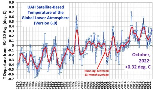
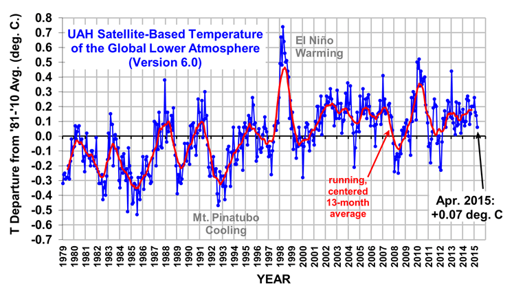
And Tom Nelson has a few more graphs the AGW folks don’t want you to see posted HERE.
Continued at ‘Primer 3: CO2’


Pingback: AGW – One man’s science is another man’s pseudo-science! Part 1. | The GOLDEN RULE