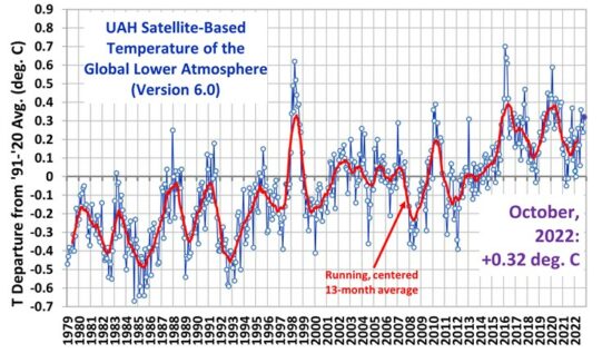
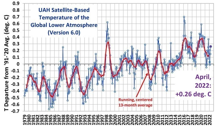
One question that has been nagging us here at the Middlebury Community Network Science Center (our desk) is, “how in heck does one measure the “global temperature” in the first place”? If we asked you what your skin temperature is right now, you’d likely answer, “Where?” The temperature on your nose is likely far different from the bottom of your feet or other places you might measure. With the greater portion of the earth covered by water, and no floating temperature recording buoys every mile or so, how can we get an “average”? Well, satellites can measure ocean temperatures ( we’ll talk more about that later ) but here in the U.S., for example there are only 1221 U.S. Historical Climatology Network (USHCN) stations, and our math shows that to be about one every 3,400 square miles.
And from that data, one can cherry-pick (as some have done ) to obtain any result he wants. For example, here are four records we cherry-picked from the whole dataset – note the temperatures are in Fahrenheit, not Centigrade:
|
Steamboat Springs, Colorado, on the other hand, |
|
|
|
|
|
|
|
| Bucyrus, Ohio doesn’t seem to have a ticket one way or the other in the Global Warming Game. Spoil Sports! |
|
What’s that straight line running through the annual average temperature readings?
The linear regression line obtained from the statistical output is the “best-fitting” straight line that can be drawn through the data. It is designated by the equation Y = b1X + b0, where X represents the year, Y represents the predicted temperature anomaly, b1 is the slope of the line and b0 is the Y intercept of the line. Now you know.
| While we can joke about individual station readings, in fact there may be something skewing the data. Berkley, California, for example, was a sleepy little town back in 1857, when the data starts. Since that time, it has grown into a much larger city, with many miles of asphalt roads operating as near-perfect “black body” heat radiators. This is known as the “urban heat island” effect. Many Climate Scientists now seriously doubt the accuracy of even the 20th century section of the hockey stick. | |
| Anthony Watts, writing in ICECAP, gives us a typical example:This NOAA USHCN climate station of record #415018 in Lampasas, Texas, was found to be tucked between a building and two parking lots, one with nearby vehicles. According to the surveyor, it is right next to the ACE Hardware store on the main street of town. While likely representative of the temperature for downtown Lampasas, one wonders how well it measures the climate of the region. In her survey, volunteer surveyor Julie K. Stacy noted the proximity to the building and parking, which will certainly affect Tmin ( the lowest temperature ) at night due to IR radiance. Daytime Tmax is likely affected by the large amount of asphalt and concrete in the area around the sensor. |  |
| You too can check the temperature history near your Grandpappy’s home by accessing the Historical Climatology Network (USHCN) stations databank. | |
Continued at Primer 8: A Convenient Lie


