
A paper published by –
Kelly MJ Department of Engineering, University of Cambridge, 9 JJ Thomson Avenue, Cambridge CB3 0FA, UK, in ‘Journal of Geography & Natural Disasters’, Feb 17, 2016.
It represents valid scientific research, data and realistic analysis proving the deliberate misleading of the public by the officially published and accepted media and involved personnel.
The beginning:
Abstract
It is widely promulgated and believed that human-caused global warming comes with increases in both the intensity and frequency of extreme weather events. A survey of official weather sites and the scientific literature provides strong evidence that the first half of the 20th century had more extreme weather than the second half, when anthropogenic global warming is claimed to have been mainly responsible for observed climate change. The disconnect between real-world historical data on the 100 years’ time scale and the current predictions provides a real conundrum when any engineer tries to make a professional assessment of the real future value of any infrastructure project which aims to mitigate or adapt to climate change. What is the appropriate basis on which to make judgements when theory and data are in such disagreement?
Keywords
Global warming; Weather; Climate change
Introduction
There have been many reports on the future impacts of humanrelated greenhouse gas emissions on a changing climate during the 21st century. Just two will suffice here: ‘Resilience to Extreme Weather’ [1] and ‘Climate Change: Evidence and Causes’ [2] were both published in 2014 by the Royal Society of London, the second report jointly with the US National Academy of Science. Both reports dwell on the expectation that in future, because of man-made global warming, we can expect extremes of weather to be both more intense and more frequent. By implication, one must allocate vast sums of money in mitigating and adapting to this future of more extreme weather.
The members of the Intergovernmental Panel on Climate Change in Working Group I are clear that man-made global warming started in earnest in about 1960, so it is reasonable to see to what extent the weather has been getting more extreme more frequently over the last 55 years. That same report suggests that IPCC scientists have low confidence in recent extreme weather events being specifically attributed to global warming [3]. Further, an additional IPCC report on ‘Managing extreme events and disasters to advance climate change mitigation’, (known as SREX [4]), relies heavily on papers that only start with data in 1950 [5] and 1960 [6]. The graphical data is not shown in SREX, as it is here, but a one-phrase summary is incorporate. Furthermore, they chose definitions of extremes that represent the upper or lower deciles of occurrence, rather than treating extremes as extremes, as is considered here.
It is therefore surprising to discover that by all the various real world data considered here, the weather in the first half of the 20th century was, if anything, more extreme than in the second half. I have not found any data, including in SREX, that contradicts these trends. Furthermore there are no signs of this trend changing (i.e. lessening and reversing) in recent years. The lack of public, political and policymaker appreciation of the disconnect between empirical data and theoretical constructs is profoundly worrying, especially in terms of policy advice being given. For example the first report cited above is without empirical foundation, the second is misleading, and the already modest claims in SREX are further weakened when compared with the longer term data.
A comment on etymology is in order: I am using the word extreme in the same way that the authors of references [1,2] to mean events that are several standard deviations away from the average of the distribution by which they are measured and described. I am not referring to the ultimate extreme in recorded history, although these would also support my case.
The approach taken in this paper is wherever possible to list the original source research yielding the data, but where that is not available to use the earliest accessible details. Not all the relevant data is located in the regular scientific literature. Much of this data is on official government-backed meteorological websites, while other data is only available secondarily or appears in appropriately derived form in various web-sites devoted to critiques in the global warming debate. To my knowledge, this material has not before been gathered systematically in the manner it has here. By referring to a much broader base than temperature data only, I hope to avoid the continuing debate on the myriad of adjustments made to original data that has almost without exception exacerbated the trends being sought, particularly in rising temperature over the 20th century. These adjustments are such that in some places (e.g. New Zealand) the inferred temperature rise is entirely a result of these post-hoc adjustments.
The Conundrum Introduced: Where the Weather is shown to have been Less Extreme Recently
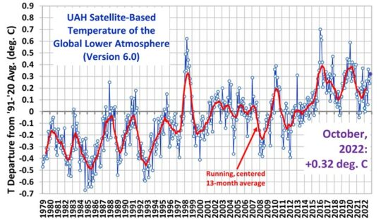
Figure 1 is a collage of data that make the case that weather was more extreme between 1900 and 1960 than since. It has been collected from the literature and from websites since the beginning of 2014. For each of these diagrams there are many more that make the same story with complementary detail, or with data from other parts of the world. This section is devoted to explaining the origin and content of each graph.
Figure 1: weather was more extreme between 1900 and 1960.
The first graph takes the HADCRUT4 data set and plots the time derivative of the globally averaged mean surface temperature from 1850 to the present day [7]. It shows that the periods of maximum warming or cooling rates are all in the 19th century or at the start of the 20th century. Since the recent period of global warming started in 1975 there has been a quiescent temperature profile. As the author states: (i) All the huge extreme changes took place over 40 years ago, with the great majority occurring prior to 1950. (ii) The huge CO2 emissions have not been associated with a single global warming acceleration extreme since 1951, over 60 years ago. (iii) Since the 1970’s, the climate extremes’ range appears to be narrowing, with each accelerated warming and cooling trend rate getting smaller. (iv) When major (minor too) extremes occur, the climate system does not hit a “tipping point” of positive feedbacks. Instead, the natural climate responds with negative feedbacks to bring the climate back to some level of short-term equilibrium. By contrast the SREX report on extreme temperatures is largely down to two key papers [5,6]. Warm maximum and minimum temperatures are expected to track with the overall average temperature [5] in the Americas, but the broadening is weak, and the extremes are eclipsed by data from the 1930s. Furthermore both positive and negative trends are present in the temperature extremes in different regions in the global data [6], so that the total extremes have some internal cancellation. The findings also were that the total precipitation was not changing but there was a weak tendency towards more extreme single incidents of precipitation. A separate study on precipitation comes to a similar conclusion, a 7% rise in daily precipitation maxima per degree C rise in temperature, but a result that masks different and opposing trends in different parts of the world [8]. Nonetheless, where extreme precipitation has actually been measured, nearly all the extremes predate this period for all periods less than one year [9]. Most recently, a report confirms that fluctuations in extreme weather events (especially temperatures) become less severe with rising average temperatures [10].
The second chart is a plot of NOAA monthly measurements of precipitation since 1895, through June 2014 [11]. The black dots represent the moving 5-year (60-month) average of atmospheric CO2 levels. The dark blue curve is the simple 60-month moving average of precipitation; the red line denotes the average monthly rainfall over the 1,434 months. The moving average and the average since 1985 are almost identical, and show that any recent suggestions of climate extremes from one-off events in the USA are not borne out by the accumulated data.
The third and fifth charts show the steady decline on average of both the frequency and power of hurricanes making landfall in the USA over the 20th century [12]. Other data, not shown here, shows a 30% step down in the frequency of tornados of strength 3 and above in the USA in 1975, the year that global cooling turned to global warming [13].
The fourth panel shows the fall in the annual cost of flooding in the USA as a function of the Gross domestic product of the USA [14]. The sixth panel shows that extremes of temperature in the USA were greatest in the 1930s, and much greater than anything different [15].
The seventh panel shows the actual decline in precipitation in Boston since 1935 compared with the predicted increase from the average of many models, showing a discrepancy in the sign of the change [16], which must be a contributory factor in the wider search for an answer to the question about whether or not extreme weather is on the increase.
The final panel summarises a key issue that is not often considered in the debate: the deaths from climate related severe weather events has been in steady decline since 1900, and if there is to be a change to an increase in future, a specific reason must be given for this to distinguish any such prediction from speculation [17]. There are multiple causes of this decrease – better warnings, more robust defences being just two.
Several points arise: (1) While some of the data is global, much of the detailed data is from the USA where the trends are all at odds with what is assumed to be happening globally. In the next section we describe data from many other places in the world showing that there has been no change in the frequency or severity of extreme weather events. Much of this is from the UK where, as for the US, has extensive networks exist for gathering relevant data over the whole period. A separate table is introduced below to summarise the scattered reports from other parts of the world. (2) It is noted that most of the data comes from official sources, but the way it has been presented and interpreted represents the added value as per the source from which the graphs were actually derived. (3) In some places we can get contradictory data as exemplified below in section 4.
The Conundrum Widens: There is much Evidence of No Change over 100 Years
(and much more).

If this raises your interest, you might find the complete paper worth reading.
This supports my own understanding of the realities of climate change, as distinct from the widely accepted, highly promoted, so-called “climate change” that is substantially dependent on dubious “science” based on achieving a political agenda.
Source Article:
Related articles:
Academia is in the New Dark Age
[https://www.nas.org/articles/academia_is_in_the_new_dark_age]
Claim: Poor Countries Face $168 billion Debt Interest Bill because Climate Change
[https://wattsupwiththat.com/2018/07/02/claim-poor-countries-face-168-billion-debt-interest-bill-because-climate-change/]


Three decades of rancorous handwavium debate over evidence for and the physics behind the Radiative Greenhouse House Effect, Green House Gasses and man-caused climate change, aka CAGW.
What a waste – since none of it is real.
That the the earth might be 33 C warmer with an atmosphere is based on the difference between two completely unrelated and made up numbers: 288 K, a wild ass guess pulled straight out of the World Meteorological Organization’s butt and 255 K, a theoretical, ideal, benchmark calculation for the “average” 240 W/m^2 Long Wave Infrared Radiation supposedly leaving the top of the atmosphere.
Furthermore, the lunar studies by Nikolov and Kramm clearly conclude that without an atmosphere the earth would be much like the moon, a barren rock with the lit/hot side maybe 390 K, the dark/cold side maybe 150 K, but nothing like 33 C colder.
The LWIR up/down/”back” GHG energy “warming” loop is another theoretical, ideal, benchmark calculation for any surface radiating at 288 K and likewise – not real. A contiguous participating media, i.e. atmospheric molecules, preclude any BB emission from the surface.
No 33 C warmer + No GHG energy loop = No RGHE & No CAGW.
Am I wrong?
Always possible – as is the case for all of us.
’cause if I’m not wrong decades of research, “evidence,” publications and billions of green dollars goes straight in the dumper and the entire trillion dollar global climate change industry is suddenly unemployed.
That just about sums it up!
Possibly wrong, but not at all likely, IMHO.
The science aspect is clearly enough to convince intelligent, thinking persons.
But there is also ample evidence of the political agenda that introduced the catastrophic warming notion with it’s associated claimed need to control countries’ resources, emissions and finances.
This can be assessed with far more certainty than any of the IPCC related predictions and solutions.
This situation is nearly as ludicrous as believing “Chicken Little ” about “the sky is falling!”. “Foxy Loxey” awaits the scaremongers!
Thanks for your comment.
Reblogged this on Lolathecur's Blog Below are two very important entries from the "Jewish Encyclopedia". Read them VERY CLOSELY..