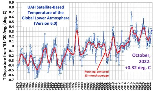
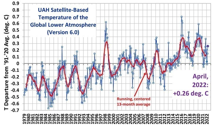
Cooking the global warming figures.
A very technical article, but even if you skim through it, you will hopefully understand the text wordings showing how temperature station selection, siting and alterations to previously published data form part of the claimed warming. The warming that is, in turn, claimed to prove AGW and the need to control CO2 emissions.
Related articles
Note: I’m blogging this from Atlanta, where I am at the TWC Pioneers reunion. Bob was kind enough to provide this post so I can relax a bit (though I think I’ll chase a NOAA USHCN weather station today anyway). His figure 10 (below) is interesting, his figure 11 even more so. – Anthony
Guest post by Bob Tisdale
With the recent release of the CRUTEM4 data came the expected two-sided discussion (argument) about the changes from the earlier version of the dataset, CRUTEM3. One side claimed the adjustments were needed, while the other side protested the increase in global surface temperature anomalies. There were also differences of opinion about where the adjustments were made. Some claimed the added Arctic surface stations were the sole contributors to the trend, and others countered that the adjustments and dataset additions impacted data globally.
Who was right about the locations of the additions…
View original post 2,166 more words


Pingback: No Heating of Ocean Surface | The GOLDEN RULE